packaging redesign.
campbell’s.
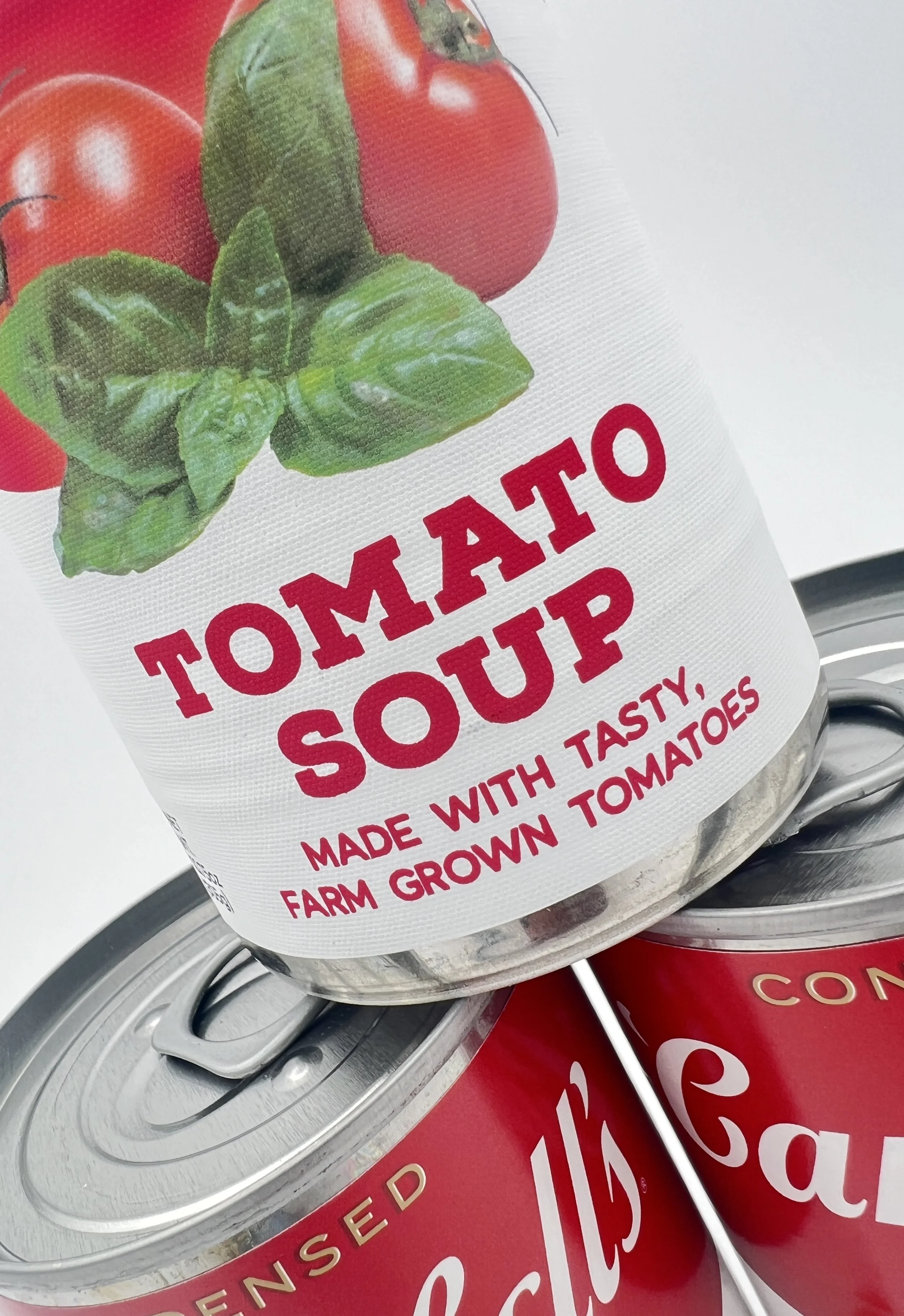
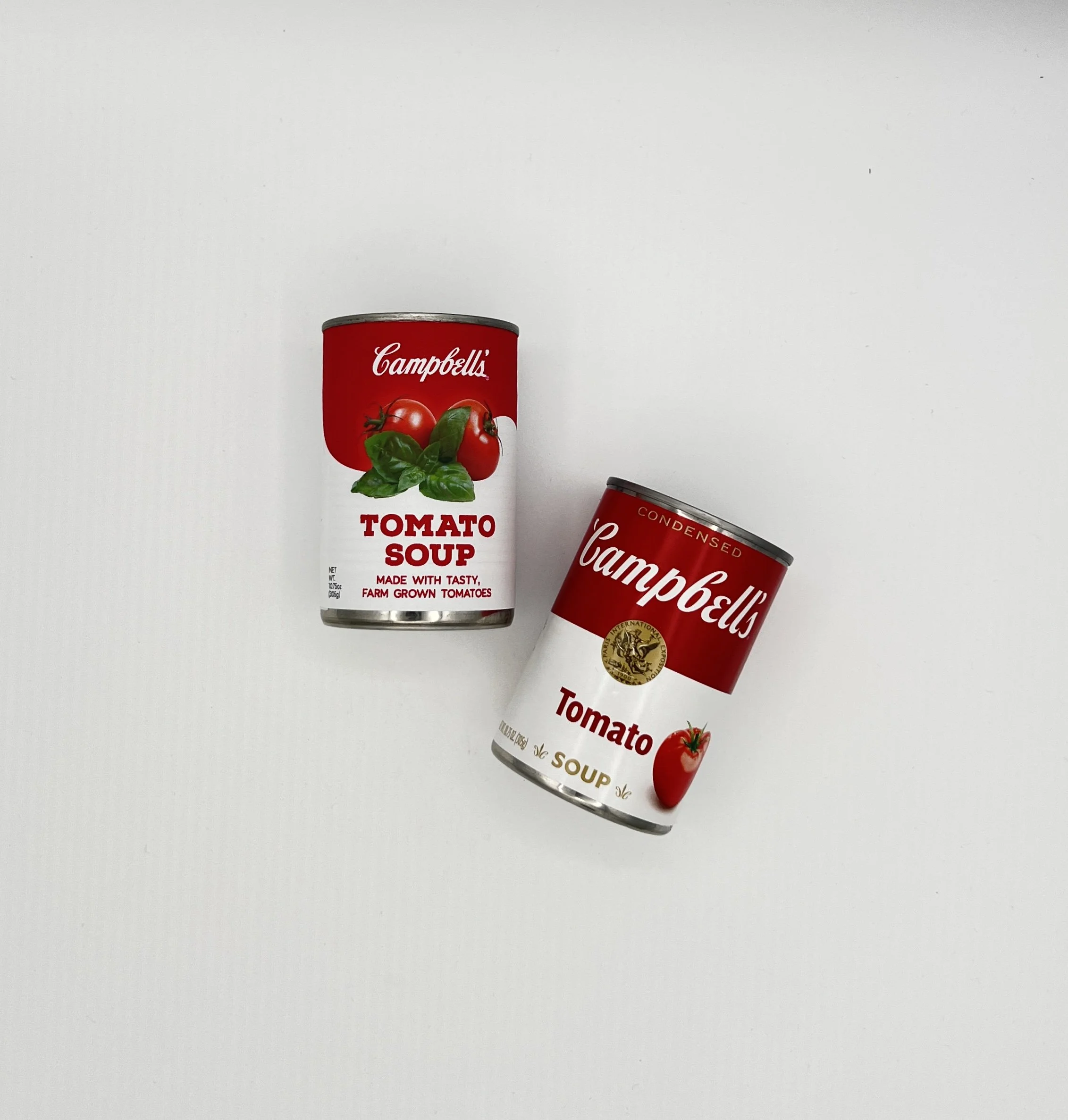
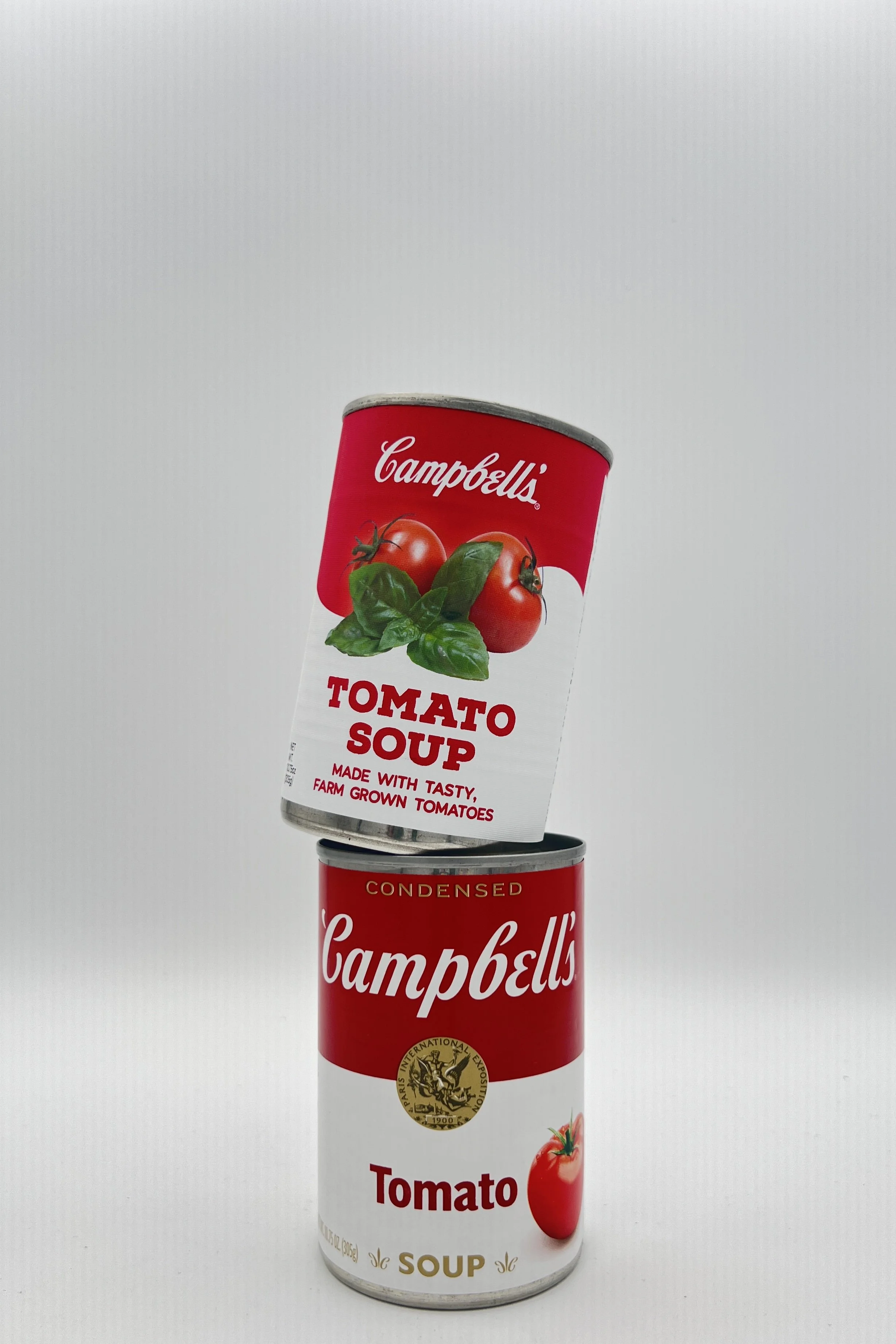
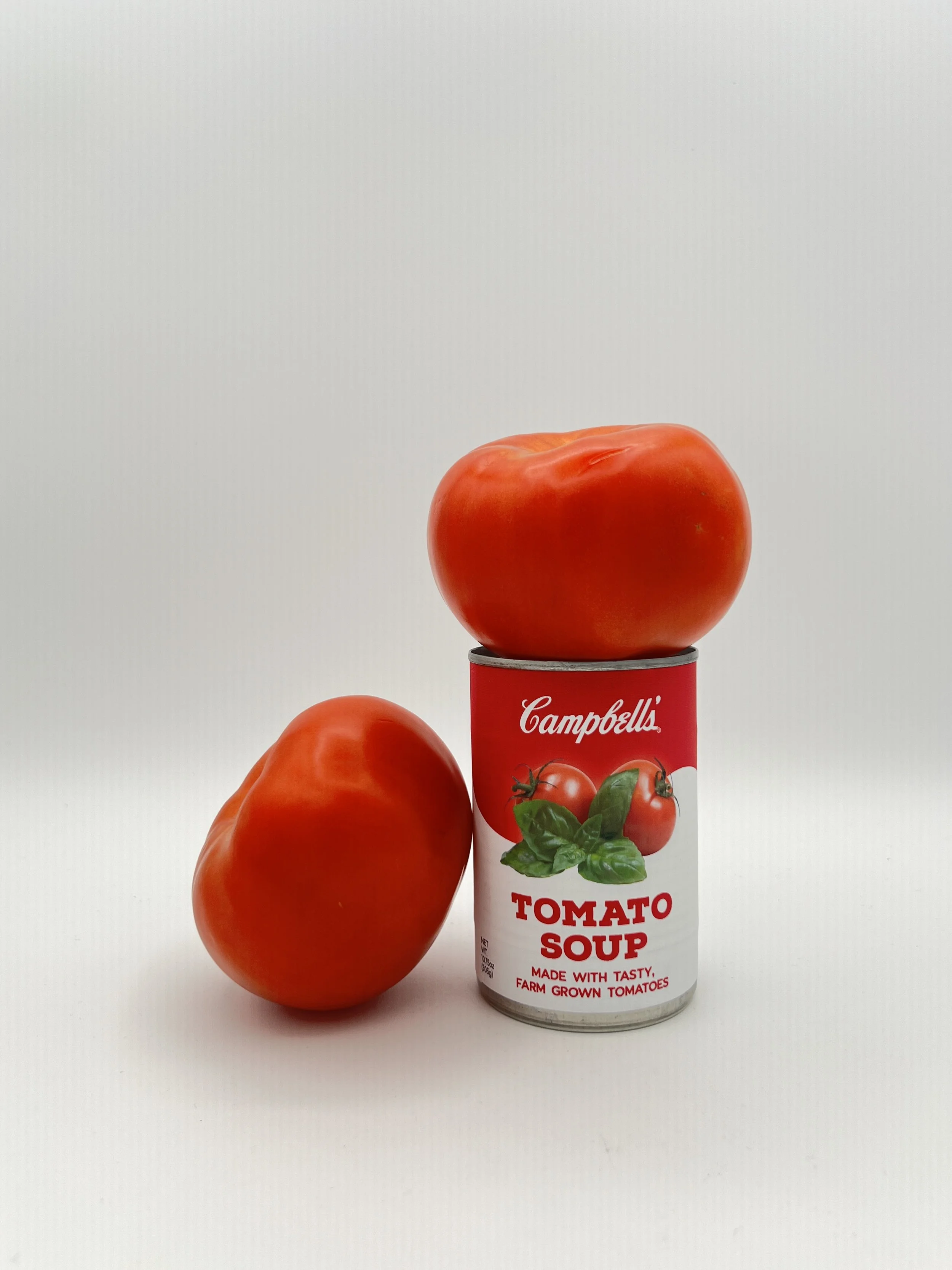
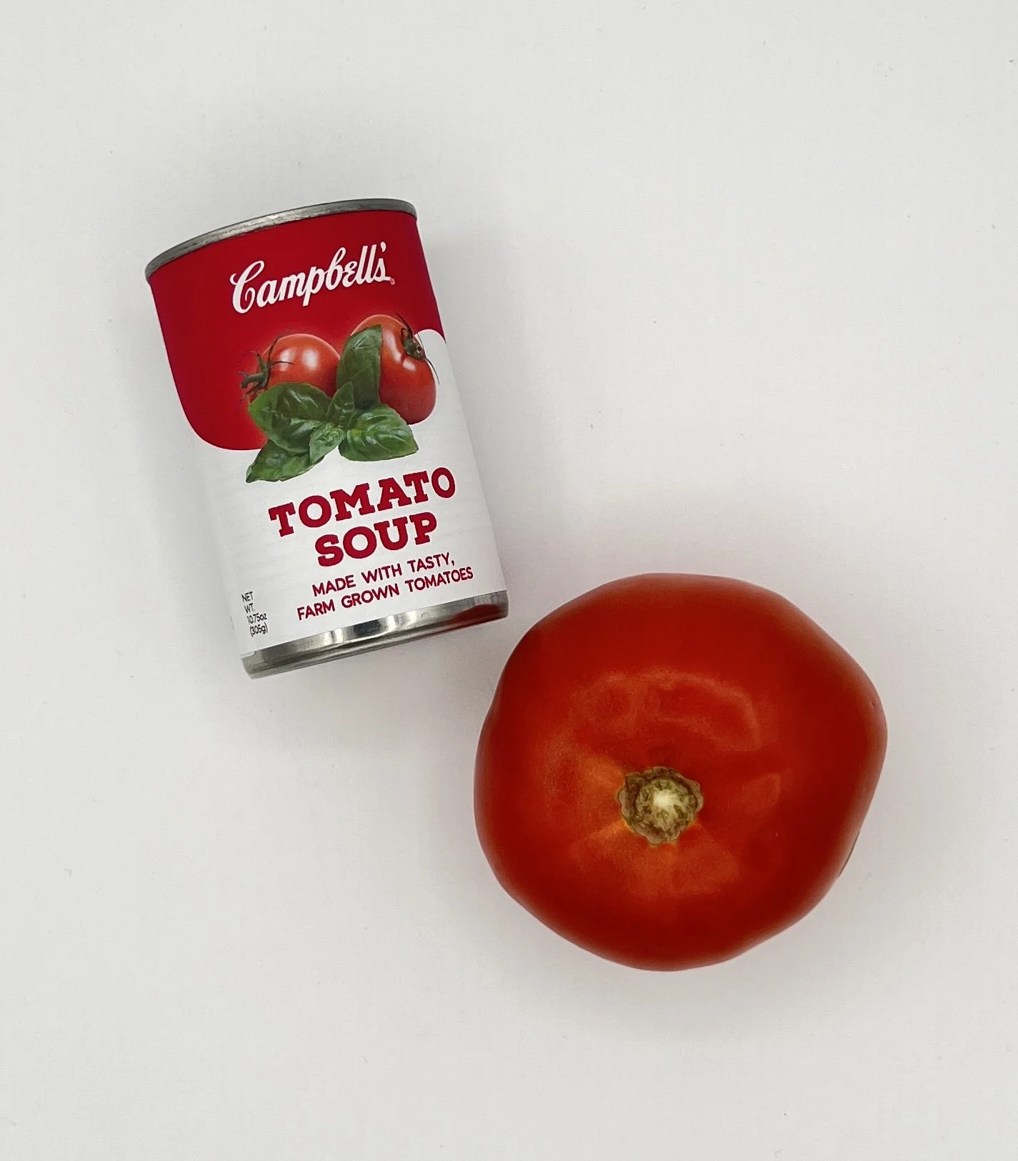
The Campbell’s Company (prev. Campbell Soup Company) is a processed and packaged food company known for a variety of products, including crackers, sauces, and most notably, soups. My redesign was focused on their classic red and white soup cans (specifically their Tomato Soup). The current packaging is very minimalist; red and white cans with the soup flavor written in a simple, sans serif type. Because their colors are so well-recognized, I wanted to keep the red and white, and also add pictures of the soup or its ingredients on the packaging. Visuals will often capture a customer’s attention before words will, something that Campbell’s soup cans falls a bit short on. Having a refreshed, more modern design, could increase appeal while still keeping the Campbell’s familiarity.