arby’s.
Arby’s is a fast-food chain specializing in meat sandwiches, particularly roast beef. It’s known for its “Meatcraft” sandwiches, featuring a variety of proteins and flavors.
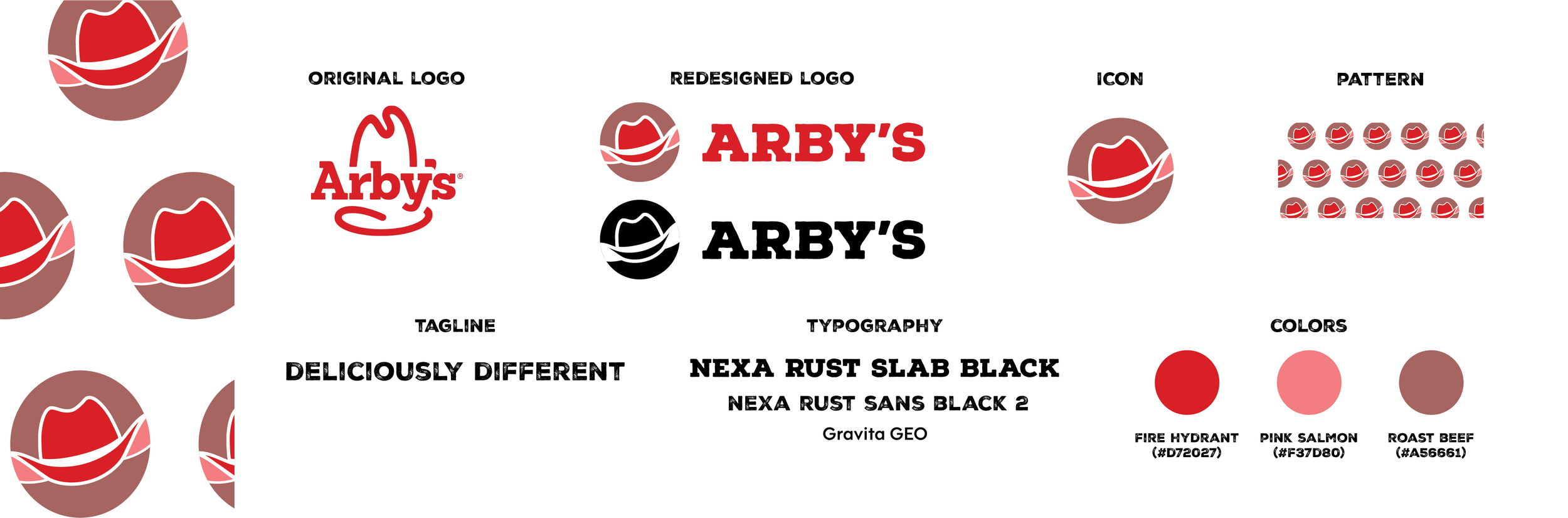
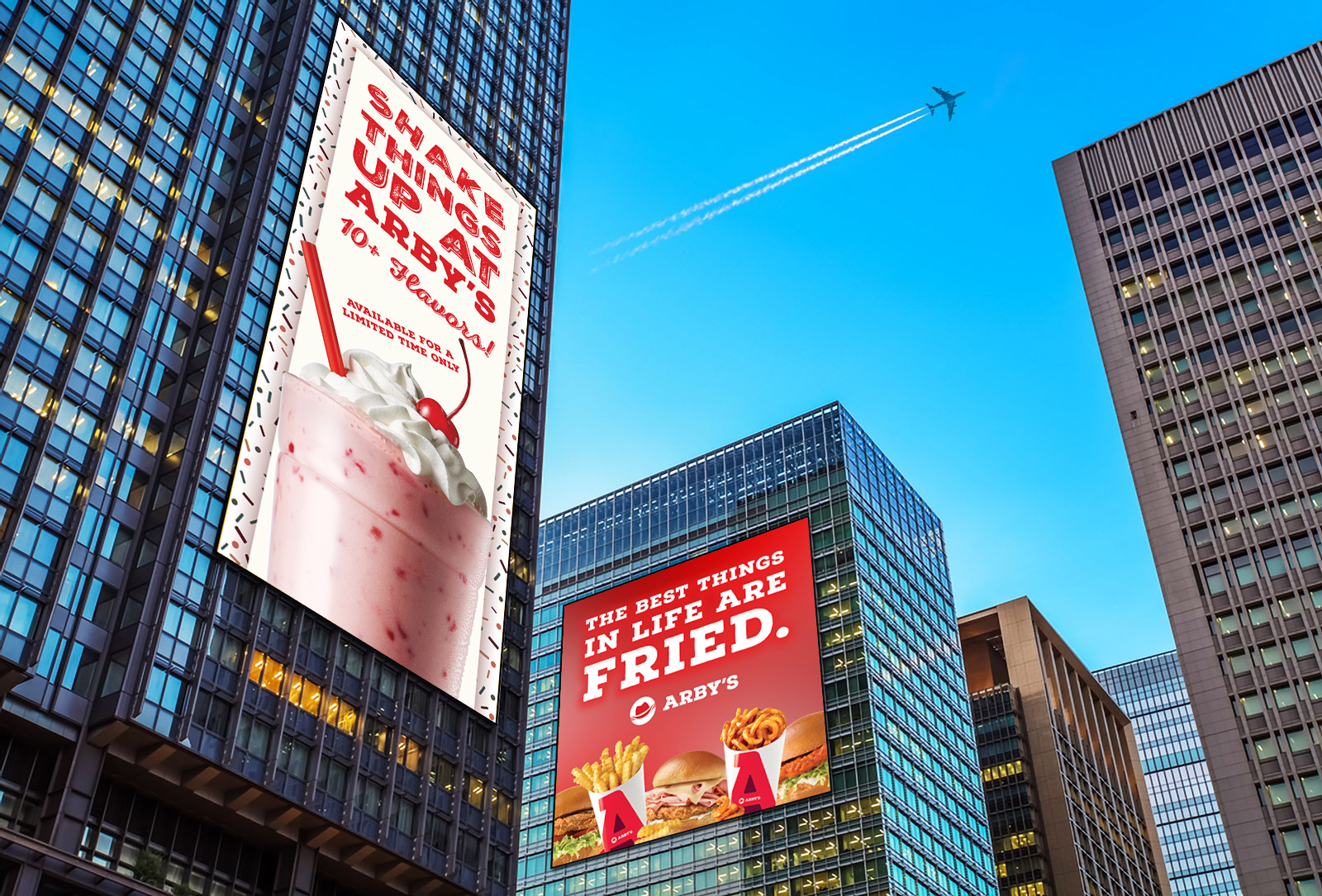
This logo redesign aimed to modernize the Arby’s brand while still focusing on the Arby’s staple: the ten-gallon hat. The hat had its charm, but if Arby’s wanted to appeal to a new audience and separate itself from the current view, it needed something new. I adjusted the brand colors to align better with other fast-food restaurants in the space and added a light pink as a nod to the restaurant’s roast beef. This new design changed the format of the logo and icon to be horizontal, aligning better with industry standards.
logo redesign & billboard design.
-
This logo redesign aimed to modernize the Arby’s brand while still focusing on the Arby’s staple: the ten-gallon hat. The hat had its charm, but if Arby’s wanted to appeal to a new audience and separate itself from the current view, it needed something new. I adjusted the brand colors to align better with other fast-food restaurants in the space while also adding a light pink/salmon as a nod to the restaurant’s roast beef. This new design changed the format of the logo and icon to be horizontal instead of vertical, aligning better with industry standards.
-
As someone who has never been to Arby’s, I had a lot of research to do to expand my knowledge of the chain. I’d seen commercials and the infamous Simpsons scene, “I’m so hungry, I could eat at Arby’s!”, a hilarious comment which is met with shock and awe by the other characters.
To start, I looked into the history of Arby’s. The name comes from the initials of its founders, the (R)affel (B)rothers. They initially wanted the name “Big Tex”, but that was taken by another business. The name, Arby’s, was paired with an outlined cowboy hat logo, simply because Westerns were popular at the time. This logo, while changing slightly over the years, has been the same since its opening in 1964. With such a long history, I checked out some of Arby’s vintage ads and promotional materials, one of which mentioned “deliciously different” within the advertisement copy, which sparked an idea.
-
The cowboy hat is an Arby’s staple, so I wanted to keep it but give it a 2025 revamp. The outlined ten-gallon hat had its charm, but if we wanted to appeal to a new audience and separate ourselves from the current view, we needed something new. I adjusted the brand colors to align better with other fast-food restaurants in the space while also adding a light pink/salmon as a nod to the restaurant’s roast beef. This new design also changed the format of the logo and icon to be horizontal instead of vertical, aligning better with what is more commonly seen in the industry.