312 & ash.
312 & Ash is a modern fine dining restaurant located in Chicago’s River North district. The name honors the city’s iconic 312 area code and the ash trees that once lined up its streets. The restaurant blends refined Midwestern ingredients with global culinary influences, offering guests a sophisticated yet welcoming dining experience.
branding and visual identity.
-
This client wanted to build a strong brand identity that reflects Chicago’s sophistication, attracting young professionals seeking upscale dining experiences, couples celebrating special occasions, locals looking for memorable nights out, and more.
-
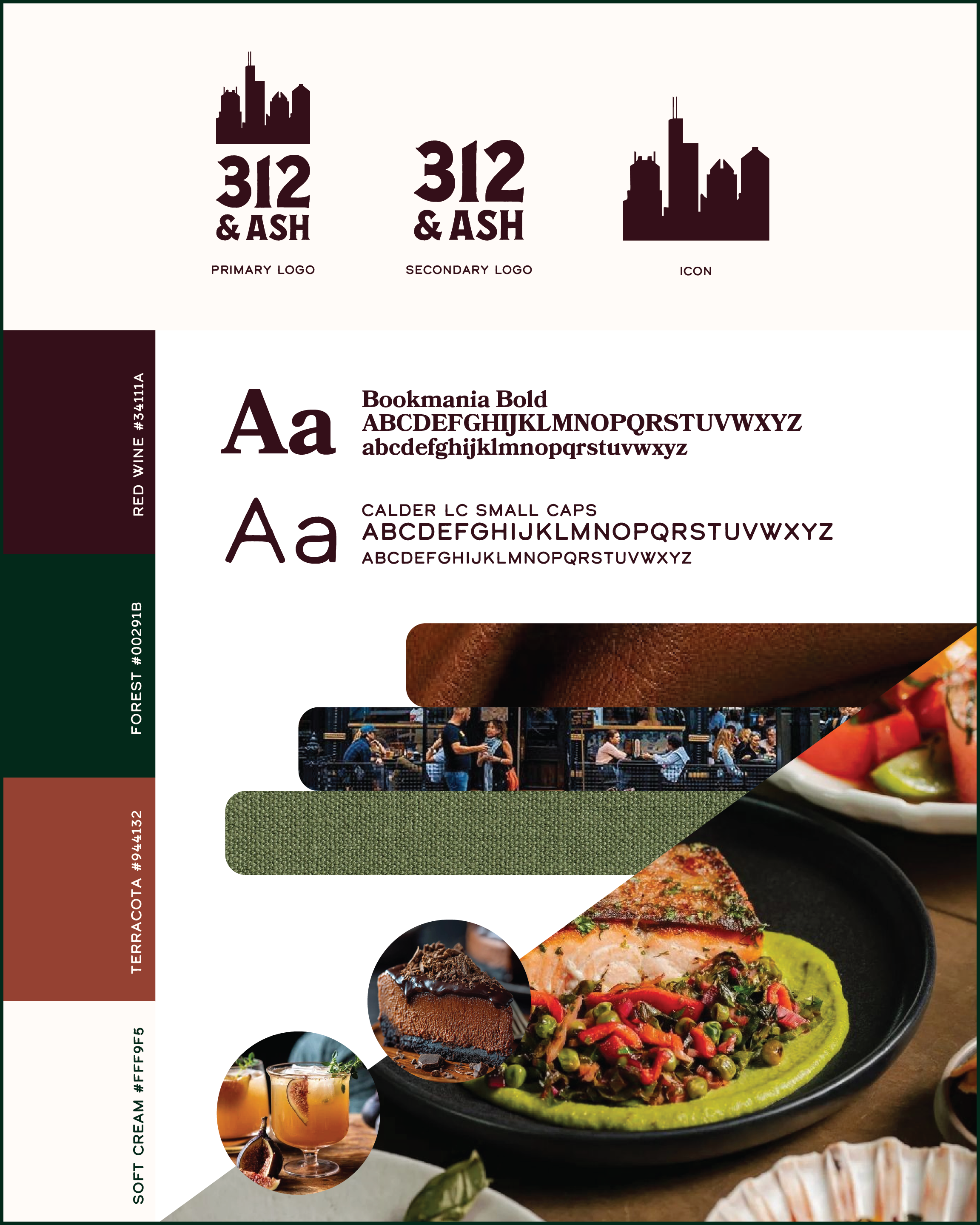
With the business being local to Chicago, the biggest element that stuck out to me was the city’s skyline. I didn’t want to limit my design options to just the skyline, though. I found some inspiration online, helping me come up with a color palette and aesthetic that matched the brand. I wanted a more rustic feel, so a lot of my initial designs consisted of rough and antique serif typography. After a few iterations on placement and matching typography, I decided to go with a clean, stacked design in a dark maroon. This logo and color palette gave off the sophisticated and rustic vibe that 312 wanted to emit.
-
Logo
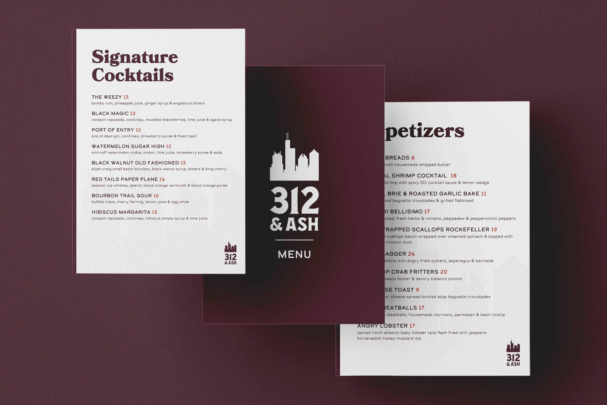
Menu design
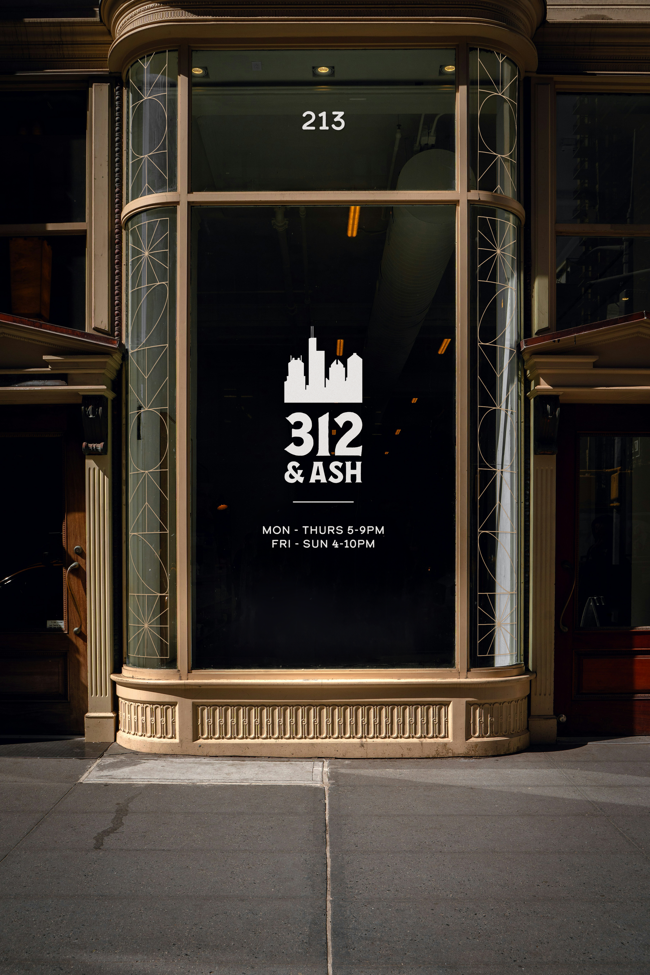
Store signage